 Free Consultation
 PCI-DSS Compliant
 GDPR Ready
 ISO 27001
 NDA Protected
 AI Services
 AI App Development
 Generative AI Development
 AI Chatbot Development
 AI Integration Services
 AI Consulting Services
 AI For Fintech
 AI Financial Assistant Solution
 AI Insurance Agent Development
 Tech Stack
 OpenAI / GPT-4
 Claude / Anthropic
 Gemini / Google AI
 Llama / Open Source
 LangChain / LlamaIndex
 Pinecone / Pgvector
 AWS / Azure AI


 Fintech Solution
 Core Fintech
 Fintech App Development
 Neobank App Development
 eWallet App Development
 Payment Integration
 Lending Software
 Banking Software Development
 BNPL Solution
 BNPL App Development
 Insurance App
 Investment App Dev
 Wealth Management App
 Crypto & DeFi
 DeFi App Development
 Crypto Wallet Dev
 Crypto Exchange Dev
 Trading Platform Dev
 Payments
 Compliance
 Fintech & Digital Regulations
 Fraud Detection
 Lending Ecosystem
 P2P Lending Platform
 Mortgage Lending
 Engagement
 Outsourcing Dev

 Mobile Development
 Mobile App Dev
 iOS App Development
 Android App Development
 React Native
 Flutter Development
 Web Development
 Node.js Development
 React.js Development
 Angular Development
 PHP / Laravel
 App Services
 UI/UX Design
 App Maintenance
 By Stage
 MVP Development
 Industry Solutions
 Healthcare App Dev
 Education App Dev
 Travel App Dev
 Real Estate App Dev
 Logistics Software
 Social Media App

 Hire Mobile Developers
 Hire iPhone Developers
 Hire Android Developers
 Hire React Native Devs
 Hire Flutter Developers
 Hire Web Developers
 Hire Node.js Developers
 Hire Angular Developers
 Hire PHP Developers
 Hire Laravel Developers
 How It Works
 Pre-Vetted Developers
 Ready In 48 Hours
 NDA From Day One
 Replace Guarantee
 Company
 About Us
 Our Work Process
 Portfolio
 Case Studies
 Blog / Insights
 Careers
 Contact Us
 Awards
 Recognition


 Offices


“Features attract users, and the design makes them stay!”
When planning an app, the focus of businesses is generally on how the application functions and what features can be added to it.
What they often underestimate is the power and importance of a solid mobile app design.
The purpose of any application is to simplify the life of a user, but what is the point of offering handy features in your app if the user can’t interact with them when required?
The design simplifies how the user interacts with your app and gives the user a sense of belonging and ease of access.
However, thousands of apps currently struggle with finding the right balance between design and functionality, as it is not easy to achieve without following the right mobile app design approach.
With the help of set mobile app design guidelines and principles, any application can be optimized to create an impact with the user interface and experience.
In this post, let us discuss all the necessary guidelines and best practices to make the most of your mobile app. Without further ado, let’s get started!
Understanding Mobile App Design
Mobile app design is a fundamental process that involves the inclusion of every element that a user can think of, from accessibility needs to aesthetics.
The idea behind the design of a mobile app is to make it appear great and work even better.
When building a mobile application, you need to give it a proper shape and design that brings your vision to life.
With the right mobile app design, you can easily reach and connect with the masses.
The application development process is incomplete without UX & UI design, and that is where your mobile app design comes in.
The whole purpose of focusing on mobile app design and planning it properly is to create an impactful experience for the users that makes them come back to your app.
The better your app design is, the more active users your app can garner. These active users convert into action, which directly brings profits to your business.
Hence, mobile app design is certainly an unavoidable factor when it comes to planning a launch application.
Mobile App Design Guidelines
Knowing the crucial nature of mobile app design and how important it is in the overall growth of your application, you may be wondering how to get started with the design process. The first thing you need to do is understand the guidelines.
You see, adhering to the mobile app design guidelines is essential as they can guide you to optimize the design elements that you have thought of, as per the platform that you have chosen.
For instance, Apple takes the initiative to provide design guidelines. Similarly, Android also offers a set of Google’s Material Design guidelines that make the app appear more in sync with the operating system and make it more impactful.
While there are significant differences between the two (we will discuss them later in this blog), the idea behind a mobile app design often aligns with both.
Some of the key guidelines that apply to both are given below –
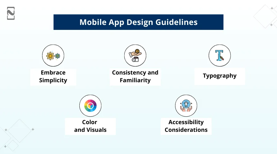
► Embrace Simplicity
Simplicity is a quality seen throughout the different versions of Mobile and its apps.
So, it is safe to say that simplicity lies at the heart of mobile app design. By focusing on clarity and ease of use, you can create intuitive interfaces that users will love.
-
Streamlined Layout
When creating a mobile app design, one must make sure the app’s layout is clean and uncluttered, with ample whitespace to allow content to breathe.
Also, try to avoid overwhelming users with too many elements on the screen simultaneously.
-
Intuitive Navigation
It’s highly recommended that one should design clear and intuitive navigation paths, utilizing familiar mobile navigation patterns such as tab bars, navigation bars, and swipe gestures.
This will enable users to navigate through your app effortlessly.
► Consistency and Familiarity
Even if you jump straight from mobile 10 to mobile 16, you’ll be able to tell that both are platforms from the same line. This shows the consistency in Apple’s approach.
Consequently, both Google and Apple’s guidelines for mobile app design also promote consistency and familiarity. This helps deliver a uniform and seamless user experience across mobile devices.
Users should feel familiar with your app and its interface, even if they are using it for the first time.
So, how can you do it? Well, here’s how:
-
Follow the Mobile Human Interface Guidelines
Stay up-to-date with the latest mobile Human Interface Guidelines provided by Apple.
These guidelines cover everything from button styles to icon design and ensure a consistent look and feel across the platform.
-
Leveraging System UI Elements
A designer should make use of native mobile controls and UI elements to maintain consistency. This includes buttons, sliders, pickers, and more.
By utilizing these elements, you tap into users’ existing familiarity with the mobile ecosystem.
► Typography
Typography plays a crucial role in the overall design of your app. Therefore, one should always pay attention to legibility and ensure that your chosen fonts enhance the user experience.
-
Clear and Readable Text
Select fonts for mobile app design that are legible and easy to read.
At the same time, avoid decorative fonts that may hinder readability, especially for longer blocks of text. Stick to the recommended system fonts for optimal results.
-
Font Sizes and Hierarchy
Designers should establish a clear hierarchy of font sizes to guide users’ attention. Use larger font sizes for headings and important information, gradually reducing the size for secondary content. Maintain consistency in font sizes across the app.
► Color and Visuals
Color choices and visuals contribute to the overall aesthetic appeal of your app. They can evoke emotions, reinforce brand identity, and navigation aid.
-
Consistent Color Palette
Choose a cohesive color palette that aligns with your app’s branding and purpose. Utilize Apple’s color guidelines to ensure your colors are harmonious with the mobile ecosystem.
-
Using Color to Enhance Functionality
Leverage color to convey information and guide users. For example, use color to indicate different states of buttons or provide visual feedback on user actions.
► Accessibility Considerations
Designing with accessibility in mind ensures that your app can be enjoyed by a wide range of users, including those with visual or hearing impairments.
-
Dynamic Typing
Support Dynamic Type to allow users to adjust the app’s font size according to their preferences. This ensures that the text remains legible and accessible for all users.
-
Contrast and Visual Accessibility
Ensure sufficient contrast between text and background colors for better readability. Consider users with visual impairments who may have difficulty discerning subtle color differences.
By following these guidelines, you can easily develop an app with a solid mobile app design. Keep in mind that while these guidelines show you a path, there are still a few things that you need to consider.
What are these considerations? Let’s find out in the next section!
UI Design Do’s and Don’ts – Best Practices
Designing a mobile app is not limited to the principles and guidelines. Certain dos and don’ts can help ensure a cohesive and user-friendly experience.
These are nothing but suggestions and best practices that you should incorporate into your mobile app design process to ensure the best results.
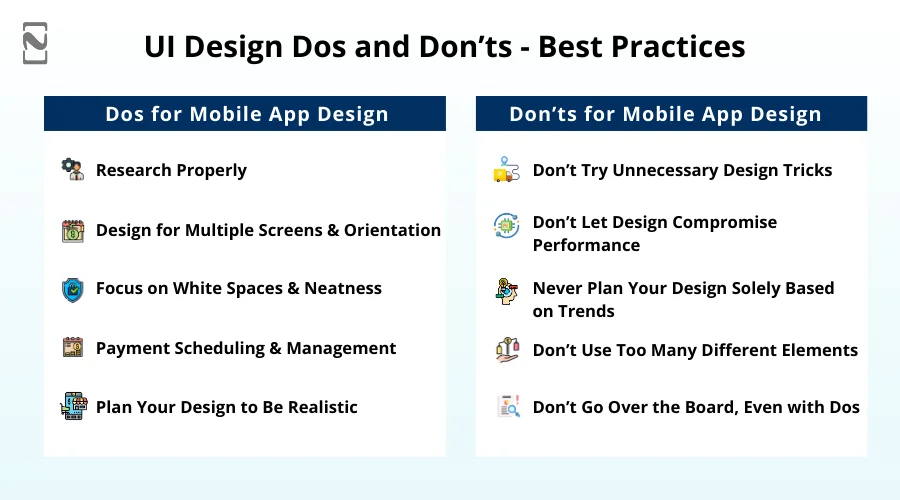
Let’s begin by understanding what you must DO to improve your mobile app design –
Dos for Mobile App Design
-
Research Properly:
The first thing you must do when approaching mobile app design is run thorough research. Identify current design trends, what your competitors are offering, and how you can fill the gaps left by them.
-
Design for Multiple Screens & Orientation
When planning the application, consider the possible screens and orientations in which the app will be used.
Try planning the design accordingly, as with the help of multiple screens, support the app can appeal to different segments of the audience.
-
Focus on White Spaces & Neatness
Your application should look aesthetically pleasing, and to achieve the same, it is important to manage white spaces and minimal elements.
Plan the screens to be more functional and less cluttered so your app appears classy and sophisticated.
-
Understanding the Optimal Requirements
The application should be optimized for all the necessary third-party applications as well as device capabilities.
For instance, if a device supports a 4K display and your application is not up to the mark with the resolution, it may appear blurry, ruining the effectiveness of the mobile app design.
-
Plan Your Design to Be Realistic
The application should be able to merge with the surrounding environment, giving it a realistic and integrated look and feel.
The use of lights, shadows, and other neat transitions can uplift the overall design and experience of your app, helping you enhance the retention of your application.
Don’ts for Mobile App Design
-
Don’t Try Unnecessary Design Tricks:
Adding flashy animations, making things more snappy, often backfires for applications, as the design elements are added unnecessarily.
Avoid using any unnecessary design elements to make the app, as it might ruin the experience for the user.
-
Don’t Let Design Compromise Performance:
While planning your mobile app design, you must ensure that the design you want to implement does not compromise the performance or usability of the application.
-
Never Plan Your Design Solely Based on Trends:
Several applications make the mistake of changing their existing simplistic design just because something trendy has popped up.
This mistake leads to disasters. Trends may come and go, but your application should be designed for the long run.
-
Don’t Use Too Many Different Elements:
Adding different elements to a single page seems to be a unique idea, but it is definitely not recommended.
The uniformity of your application is ruined when you plan to incorporate multiple design elements into the app, making it appear odd.
-
Don’t Go Over the Board, Even with Dos:
Too much of anything is harmful to your app. For instance, if you try to reduce the features completely to make your app look less cluttered, you might need to compromise on the functionalities, which is again a minus for your app.
Hence, don’t go overboard with design, functionality, or any other element. Balance is certainly the key.
Based on these dos and don’ts, you should approach the mobile app design. If you are wondering how mobile app design works, then do not worry, as we have shared the complete set of steps in the next section.
How to Design an App for Mobile?
When it comes to mobile app development, the process is completely defined and can be found quite easily. However, the design process is something that differs around the world.
To give you a better understanding, we have shared a thorough app design process that you can use.
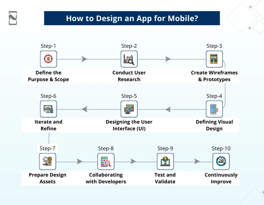
Here are some essential steps to guide you through the process:
Step 1: Define the Purpose and Scope
Clearly define the purpose and goals of your app. It is first and foremost an important app that identifies the target audience, their needs, and the problem your app aims to solve.
Plus, determine the scope of your app, including its core features and functionality.
Step 2: Conduct User Research
You can easily gain user insights by conducting app market research. Understand their preferences, behaviors, and pain points. This research will help you create user personas and establish a user-centered design approach.
Step 3: Create Wireframes and Prototypes
Now create sketches of wireframes, which are basic visual representations of the app’s layout and functionality.
Wireframes help you determine the overall structure and flow of the app. Then, create interactive prototypes using design tools or prototyping software.
Prototypes allow you to test and refine the user experience before moving to the development phase.
Step 4: Defining Visual Design
Develop a visual design that aligns with your app’s purpose and target audience. Also, consider factors like color schemes, typography, and iconography.
Adhere to Apple’s Human Interface Guidelines (HIG) to ensure a consistent and familiar mobile experience.
Step 5: Designing the User Interface (UI)
Based on the wireframes and visual design, create the actual user interface (UI) design of your app. Pay attention to details like button placement, navigation elements, and interactions.
Ensure the UI is intuitive, easy to navigate, and visually appealing.
Step 6: Iterate and Refine
Seek feedback from potential users, stakeholders, and designers.
Plus, conduct usability testing and iterate on your designs based on the feedback received. Continuously refine and improve the user experience to ensure a polished final product.
Step 7: Prepare Design Assets
Now prepare all the necessary design assets, including icons, images, and animations.
Optimize them for different screen sizes and resolutions to ensure they look great on various mobile devices.
Step 8: Collaborating with Developers
Work closely with developers to ensure that designs can be implemented effectively. Provide them with design specifications, assets, and documentation to facilitate the development process.
Maintain open communication to address any design or development challenges.
Step 9: Test and Validate
Before launching the app, conduct thorough testing to identify and fix any bugs or issues.
Test the app on different devices and screen sizes to ensure compatibility and responsiveness. Validate the app’s functionality, usability, and performance.
Step 10: Continuously Improve
Release the app to the App Store and gather user feedback.
Analyze user behavior and engagement metrics to identify areas for improvement. Use this feedback to iterate and release updates that enhance the app’s features and user experience.

Through these steps, you can plan and design the application of your choice. Generally, hiring a mobile app design company is recommended as the experts have more experience in fulfilling each of the steps.
The best part is that all these steps can be implemented for both iOS and Android app designs. You may be wondering if all the practices apply to them both, then why do they appear different?
Well, to answer this question, we have drawn a comparison between iOS app design and Android app design. Let’s take a look!
Difference Between iOS and Android App Design
| Aspect | iOS app design | Android app design |
| Design guidelines | Follow Apple’s Human Interface Guidelines (HIG) | Follow Google’s Material Design Guidelines |
| Visual Style | A clean and minimalistic design approach | Bold and vibrant design approach |
| Navigation Patterns | Primarily uses bottom tab bars and navigation bars | Often incorporates a side navigation drawer and tabs |
| Typography | Generally relies on the San Francisco font | Often uses Roboto font |
| Icons | Typically uses rounded square icons | Typically uses flat and geometric icons |
| Back Button | Relies on a system-provided back button | Often incorporates an on-screen back button |
| Gestures | Utilizes swipe gestures for navigation | Utilizes more varied gesture-based interactions |
| Fragmentation | Limited device and screen size variability | Wide device and screen size variability |
| Development Tools | Requires macOS for development | Supports development on various platforms |
| User Behavior and Demographics | Popular among users in Western countries | Popular among users globally, including emerging markets |
Best-Designed Mobile Apps To Get Inspired
If you’re looking for inspiration from well-designed mobile apps, here are a few notable examples:
♦ Airbnb
Airbnb has stunning visuals, intuitive search filters, and a user-friendly booking process, offering a delightful user experience for travelers.
♦ Evernote
Another well-designed mobile app is known for its clean and organized design. Evernote provides a clutter-free interface for note-taking with easy-to-use navigation and a focus on productivity.
Pocket is a prime example of a well-designed mobile app that offers a delightful user experience. The well-crafted design focuses on simplicity, ease of use, and providing a visually pleasing reading experience.
Its intuitive interface and thoughtful features make it a prime source of inspiration for designers looking to create user-friendly and content-focused mobile apps.
♦ Headspace
This meditation and mindfulness app features a calming and visually appealing interface, using soothing colors, delightful animations, and thoughtful interactions to create a serene user experience.
♦ Overcast
Lastly, a popular podcast player, Overcast, delivers a sleek and user-friendly interface with its minimalist design and intuitive controls.
Plus, advanced features like smart speed and voice boost.
Conclusion
With all things considered, you might have understood how crucial it is to find the right team of UI/UX designers.
It is undeniable that without a proper mobile app design that follows design principles and guidelines, it is impossible to develop an app that reaches and connects with the masses.
We at Nimble AppGenie are well-versed in delivering high-quality applications that are designed for the target audience.
If you are planning to invest in mobile app development services, make sure you find experts who understand the crucial role that mobile app design plays.
Hopefully, this post helps you discover the best practices for designing mobile apps.
Thanks for reading. Good luck!
FAQs

Niketan Sharma, CTO, Nimble AppGenie, is a tech enthusiast with more than a decade of experience in delivering high-value solutions that allow a brand to penetrate the market easily. With a strong hold on mobile app development, he is actively working to help businesses identify the potential of digital transformation by sharing insightful statistics, guides & blogs.
Table of Contents
No Comments
Comments are closed.